Data and visual journalism
in 7 lessons
I'm Alvin Chang, a data and visual journalist. This is a seven-lesson guide on getting started with data and visual storytelling.
This is not comprehensive by any means. Rather, it's a productive first step. By the end of these seven lesson, you'll have more tools in your data and visuals toolkit. You'll also have an idea of what skills you want to build out further.
If you get stuck on anything, feel free to email me! alvinschang[at]gmail.com
2. Finding your own data: Where data comes from
3. Preparing your data: Formating and cleaning
4. Visualizing data: The basics of charts and diagrams
5. Building your story: Conceptualizing a project
6. Making your project: Executing on your vision
7. The community: Getting to know the data viz world
We're going to jump right in and analyze a dataset. I want to help you recreate some of the magic I felt the first time I felt the superpowers data can offer.
The first thing we'll do is dig through a dataset and do some analysis. Follow this video tutorial. It will take about an hour.
Now you have an idea of how to explore the data. Try opening another dataset in Google Sheets and exploring on your own. Pick one of the following:
We've been using Google Sheets, but you could also do the same things in Microsoft Excel.
If you want to wrangle bigger datasets, you'll need to learn some data programming languages, like R or Python. These are a bit of a commitment to learn, so I recommend you finish this course before jumping into these tutorials:
This section covers what data is, where it comes from, and how you can find datasets.
Any observation that a human records is data. Someone's diary is data; the US census is data.
The difference is that a diary is unstructured observation; a census is highly structured, in that it uses the same process for each observation.
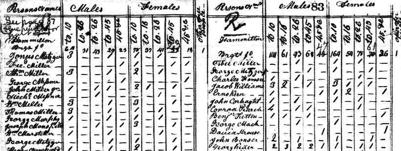
For example, in 1790 Census workers went door to door and wrote down how many males and females lived in each household. It's a story of a town, but it's also structured data:
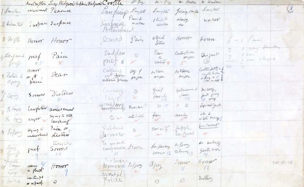
In 1868, Charles Darwin showed his friends pictures of a person being prodded with an electric current. This easily could have been recorded in narrative format. But instead, he did this:
And in 1854 during the cholera epidemic, physician John Snow gathered stories of people infected with the disease. But then he went back and mapped the location of these stories. He found structure in stories that were unstructured. (This was used to further prove his theory that a contaminated water pump was to blame.)
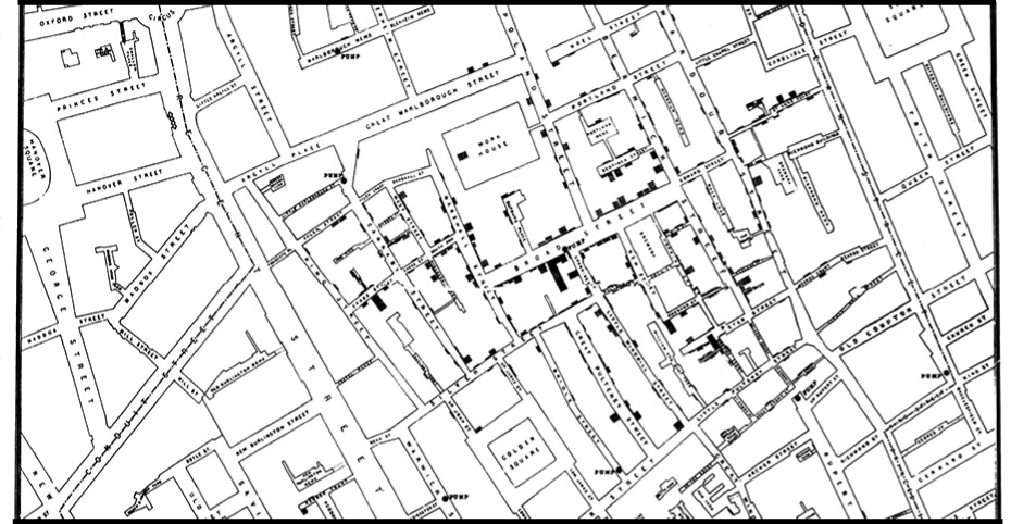
These days, people collect and record data of all sorts.
- Sometimes it's required by law. For example, here's a list of datasets every government reporter needs. Go through each one and think about who is collecting the data, and why they might be collecting it.
- Sometimes people collect it for projects. This project, by The Pudding, collected data on the size of jean pockets. The journalists went to the store and literally measured jeans!
- And, like John Snow, you can turn unstructured stories into data. For example, I took a transcript of a Congressional hearing and turned it into data for this story.
Some of my favorite data sources are:
- Data is Plural: A list of datasets maintained by Jeremy Singer-Vine. Sign up for his newsletter here.
- Kaggle: Datasets here tend to be very clean, but you have to make sure you figure out where the data is sourced, since it's user submitted.
- Information Is Beautiful: A lot of clean dataset here, but it's not a wide variety.
- Google Dataset Search: If you're looking for data, try searching here. The results are hit or miss, but it can be slightly better than just pure Googling.
- Your city or state data portal. Google "[your city/state] data portal" and see what you can find. For example, here's New York City's data portal.
- Census Reporter: This is census data, but in a more accessible format. If you want more customizable data (and a slightly steeper learning curve), try this tool.
Explore these datasets. Find one that's especially interesting and bookmark it for the next lesson. (Make sure to keep track of the source of your data.)
Today we'll cover how to get your data ready for analysis.
You have some data you want to explore. But how do you take the data file and bring it into Google Sheets?
Go back to the dataset you bookmarked from the previous lesson. We're going to bring this into Google Sheets.
First find out the data format. You can figure this out by looking at the extension. For example, for the below file the extension is "csv."
Then use one of the below guides:
Excel: These are files ending with .xls, xlsx, .xlsm, .xltx, or .xltm. This is a proprietary Microsoft Excel format. To upload into Google Sheets, go to File > Import > Upload.
CSV or TSV: CSV stands for "comma separated values." TSV stands for "tab separated value." The reason is simple. Here's what a CSV file looks like, if you were to open it in a text editor:
Alvin,33,mango
Amanda,32,strawberry
Augustus,50,orange
And here's what the spreadsheet would look like:
| name | age | favorite fruit |
|---|---|---|
| Alvin | 33 | mango |
| Amanda | 32 | strawberry |
| Augustus | 50 | orange |
The commas separate each column. The line breaks separate each row. TSVs are similar, except instead of commas separating the rows, it's tabs.
When you try to download a CSV, sometimes it opens up in your browser (like this.) In that case, press "cmd-s" or "ctrl-s'" on the webpage and it will allow you to save the CSV to your computer.
To upload a CSV or TSV into Sheets, go to File > Import > Upload.
JSON: This stands for Javascript Object Notation. It's used by a programming language called Javascript.
I recommend trying a JSON to CSV converter online, like this one. (You can Google around for a few different versions.) Once it spits out a CSV, use the same process that you would a CSV.
Sometimes, JSON files can't be converted into a spreadsheet format. Ask me for help. As you learn more, you'll find ways around this.
PDF: Sometimes a bunch of tables are stuck on a PDF. These are not meant to be read as data, but there are tools that can help us out.
If the PDF has computer-readable text, it's easy. But if it's hand-written table or a scanned piece of paper, that gets much harder and requires Optical Character Recognition (OCR) which means the computer has to try to read the image.
Either way, try using Comet Docs (free for journalists) or Tabula. Also, if it's a smaller dataset, it might be worth doing it by hand and double-checking your work.
SPSS or STATA: These are both proprietary formats used by fancy data analysis programs. Frankly, it can get confusing and annoying to convert these formats into CSVs. Take a pass on these for now.
You may notice that your data has some errors or inconsistencies. For example, maybe there's a column for city and New York City is spelled "NYC" and "NY City" and "New York." Or maybe there are duplicate rows. Or maybe some data just looks... wrong. For example, check out this dataset of the 1996 Chicago Bulls:
| player | height | college |
|---|---|---|
| Michael Jordan | 6-feet-6 | UNC |
| Dcottie Pippen | Six-foot-eight | University of Central Arkansas |
| Steve Kerr | 6-3 | Arizona |
| Michael Jordan | 6-6 | University of North Carolina |
| Toni Kukoc | 6-10 | |
| Dennis Rodman | 1-1 | SE Oklahoma State |
| Randy Brown | 6-2 | Houston/New Mexico St. |
| Ron Harper | 78 | Miami |
This means you have to "clean" your data.
First watch this short video about working with functions in Google Sheets.
Then read this post from Paul Brawshaw about cleaning data. He uses Excel, but it also works in Google Sheets.
Go through your data to see if anything needs to be cleaned. The goal is to have consistent, accurate data in each cell.
Now that your data is clean, analyze your data! Remember what you did with the Titanic data; you asked specific questions and tried to answer it using the data. Find at least three interesting findings in your data and write a short paragraph describing each finding.
This section covers how to develop the visual instincts that help you make clear and concise data viz.
Read and watch the following:
- Read the WSJ Guide to Infographics OR Data Visualization Handbook. Both show you best practices in data visualization. A lot of the lessons feel like things you've known your entire life, but you've never been able to articulate.
- Then read this piece by Kennedy Elliott on why certain visual representations of data make more sense to humans than others. It helps you understand why some of the lessons in the above book ring true.
- Pull it all together by watching this talk by Alberto Cairo.
In the previous lesson, you found three potential stories in your data. Pick one of them. Using pen and paper, visualize that one finding in three ways.
Keep in mind that your goal is to convey the story you found in the data.
When you're done, show it to a friend and ask them if it makes sense. Often they'll say it confuses them, and you'll need to be patient and curious about why it doesn't make sense. Untrained readers can have a difficult time reading and critiquing data visualizations, but that's also what makes their feedback so valuable.
Once you know what's in your data, you need to figure out what story to tell.
Read these two posts on how two people deal with this question:
- What is a data story? by Jon Schwabish
- Continue, pivot, or put it down by Amber Thomas
The way I think about stories is by breaking it down into three parts:
Content: Figuring out the story you want to tell and who you want to tell it to. I often focus the piece by thinking about these questions:
- What is the headline of the story? Would I click on it?
- What is the backstory that makes it interesting?
- After someone reads it, how would they describe the story at a party?
- How would someone tweet about it in one sentence?
Form: Is it a video on YouTube? An interactive on the web? A still graphic in print? This will change the storytelling, and maybe even the content. I try to focus my concept by answering two questions:
- Should it be a linear or nonlinear story? A video or longform feature is a linear story because everyone gets the story in the same order. A game, map, or diagram might be nonlinear because it's more about exploration.
- Should it be static or interactive? Sometimes you want the story to change based on a choice the reader makes, like specifying where they live. For example, in this piece, I ask the reader to select their school district and the story changes based on that. Other times, you just want all readers to see everything in the same order.
Of course some of this will depend on your technical abilities. But having a concept and needing to execute it is an amazing way to learn new skills. This is largely how I learned what I know.
Storytelling: Once you know the content and form, you have to develop the journey you imagine readers will go through. I think about these questions:
- Can it be told in one image? Often data stories are drawn out, when the whole story can be told in a single chart. This piece is a good example; the chart is all you need. There's no need for a bunch of other storytelling that few people will read.
- Does it require context for the data to make sense? If so, how can you tell a good story with the context and the data?
- What's the narrative "shape" of the story? Watch this Kurt Vonnegut video. How do you get someone into a data story, create that rising action, and the narrative peaks? It doesn't have to be a narrative, but you do want readers to feel like your piece has a destination.
I think the following stories do a good job of navigating some of these questions:
Take the dataset you analyzed, and shape a story. Answer the questions I laid out above, and then script out the things you want to make.
- If it's a video, fully script it out along with your videos. Make sure you actually sketch out the visuals that you plan to use.
- If it's a longform visual story, outline of the piece with sketches of the visuals.
- If it's an interactive, sketch out the different stages of what the user will go through.
- If it's a series of charts, sketch out those charts and what order they'll go in
- And if it's something else entirely, find some way to put pen to paper in order to get your thoughts out of your head.
If you feel like you're stuck on a concept, try to diagnose what you're struggling with. Be honest with yourself. Often it's because you have blockers that you haven't articulated. Maybe the content isn't quite fleshed out; maybe you really don't want to learn a new skill, but it's required for the concept; or maybe you just feel like your idea is... bad.
It's okay for your projects to be bad. There is no way to be good without being bad many, many times. But the wonderful thing about admitting that is that, while you're making bad things, you start seeing sparks of really great things. At the beginning of my career, I made many bad charts and bad interactives. But each time, I found things that worked well and I carried them into my next project.
If visual conceptualization interests you, I recommend reading Understanding Comics. It's specifically about comics, but it's also about how to conceptualize a story based on your content and form.
There are many ways to execute on a project. Today we'll talk about some of your choices. These aren't comprehensive by any means. There are entire courses on these topics! (I've found some good ones on Udemy.) I just want to give you an overview of some of the options.
In a perfect world, these tools are just a means to an end. You come up with a concept and then you pick the tools that help you execute.
But we all have technical hurdles that might constrain what we can do. In that case, you can either pivot your concept OR you can use it as an opportunity to learn a new technical skill. If you have time, I encourage you to try a project that expands your technical limitations.
Given the concept you came up with, pick one of these tools to help you make your project:
Paper/pencil/pen: This is one of my favorites, because it leads to some of the best visual stories out there. The Dear Data project is drawn by hand. Mona Chalabi's work is drawn by hand. And my former colleague Sarah Kliff wrote this piece on the gender wage gap using a white board. I often draw things and then take pictures of them. Or if you have an iPad and Apple Pencil, I love using Procreate.
DataWrapper: This is my favorite chart generation tool online. You can make all types of charts and maps, as long as you structure your data in the way they want it.
Flourish: This is also a chart generation tool, but it also allows for interaction and animation. It's slightly more complicated, but you can often take templates of what other people made and tweak it to your own liking.
Adobe Illustrator: Making charts in Illustrator is incredibly annoying, but it also allows for a huge amount of customization. You'll likely be exporting these out as still images, but I often use Illustrator to make simple charts and diagrams. Here's a nice guide on the basics of Illustrator. Here's a nice guide on how to make charts in Illustrator. If you don't want to pay the subscription cost for Illustrator, a cheaper option for vector art is Affinity Designer and a free option is Inkscape. Both have plenty of tutorials online for how to make charts.
Coding: If you know some HTML, CSS, and Javascript, you can custom code some charts and interactives.
- Basic charts: My favorite library for basic charts is HighCharts.
- Maps: The easiest library to make maps is Leaflet. Another one I like is Mapbox GL JS. If you don't need an interactive map or you just need a map to export into another program, check out my guide to QGIS.
- For artists: If you want complete customization and you're more of an artist, Processing is a wonderful language and tool. Learning Processing by Dan Shiffman is a great book. Even if you don't know any code, you can get started without much of a learning curve.
- For professionals: Lastly, D3 is a library for Javascript that allows you to make highly custom charts and visuals. If you know a little Javascript, this is a powerful library to explore.
Execute on the plan you made! It will take time and you'll adjust along the way. Consider posting the final product to Medium or YouTube or your website.
As you work through your project, you may consider hooking into the data and visual journalism community.
- Sign up for newsletters: Data is Plural sends you great datasets every week. Numlock News sends you an aggregation of some of the best data and visual journalism each week.
- Bookmark data viz websites: FlowingData has both original data visualizations by Nathan Yau, as well as how-to guides. Andy Kirk's Visualizing Data covers other people's data viz work. Information is Beautiful runs an award competition that helps them compile data viz projects. And The Pudding makes beautiful data viz essays.
- Subscribe on social: The News Nerdery Slack is a wonderful place to ask questions and hang out with other data viz journalists. NICAR has both a conference and a listserv. I've also compiled a Twitter list of data/graphic journalists.
- Conferences: Here's a big list of data viz conferences. Some are more journalistic than others. Some are more technical than others.
- Jobs boards: Open News, IRE Jobs, Data Journalism Jobs, and Indeed are good sources. The News Nerdery Slack (above) also has a job postings channel.
- Other beginner guides: Other people have compiled documents on how to get started in data journalism. Here's one by Caitlin Ostroff and another by Gurman Bhatia.